Home loans for good
Redesigned the ANZ Home Loans web experience to drive ‘top of the funnel’ conversion, resulting in application lead starts increased by 24%, leads completion increased by 7%.
Team
Home loan / Design Systems / Content
Role
Lead UX designer
Tools
Sketch / Invision / IBM Tealeaf / Atlassian
Why redesign home loans shopfront experience?
The business would like to drive ‘top of the funnel’ conversion.
Home loans are the engine of a banking business. They drive significant sales.
The home loans section receives 366,000 non-campaign visitors annually. However, a high bounce rate and low conversion rate have been adversely affecting the business.
"Dog's breakfast" was how they described it under the table.
Too many cooks in the kitchen
I was engaged as a contract designer to address these issues. Before I realised, there was another senior UX designer plus 2 content strategists just joined the team recently. In addition, ANZ UI team was half-way forming its design system. Ambiguity of component usage was another issue.
No clear roles and responsibilities were given at the start.
How was I suppose to carry out UX activities if there were too many cooks in the kitchen?
Every crisis brings an opportunity
I intentionally spent a bit more time building relationships with everyone in the team to understand their personalities, goals and personal lives.
I realised the other senior UX designer has a very strong UI background, so I suggested I could do more User Research activities. Agreement was happily made.
How I got there
Define personas
Banking is in everyone's life. I was keen to understand who are our customers and how real customers were using our website.
I initiated branch visit.
During frontline staff interview, I understood ‘First home buyers’ and ‘refinancing customers’ were two biggest groups of customers. First home buyers need hand-in-hand nurturing when it comes to buying a property, whereas refinancing customers desperately compare our rates and reach out for the calculators to crunch the numbers.
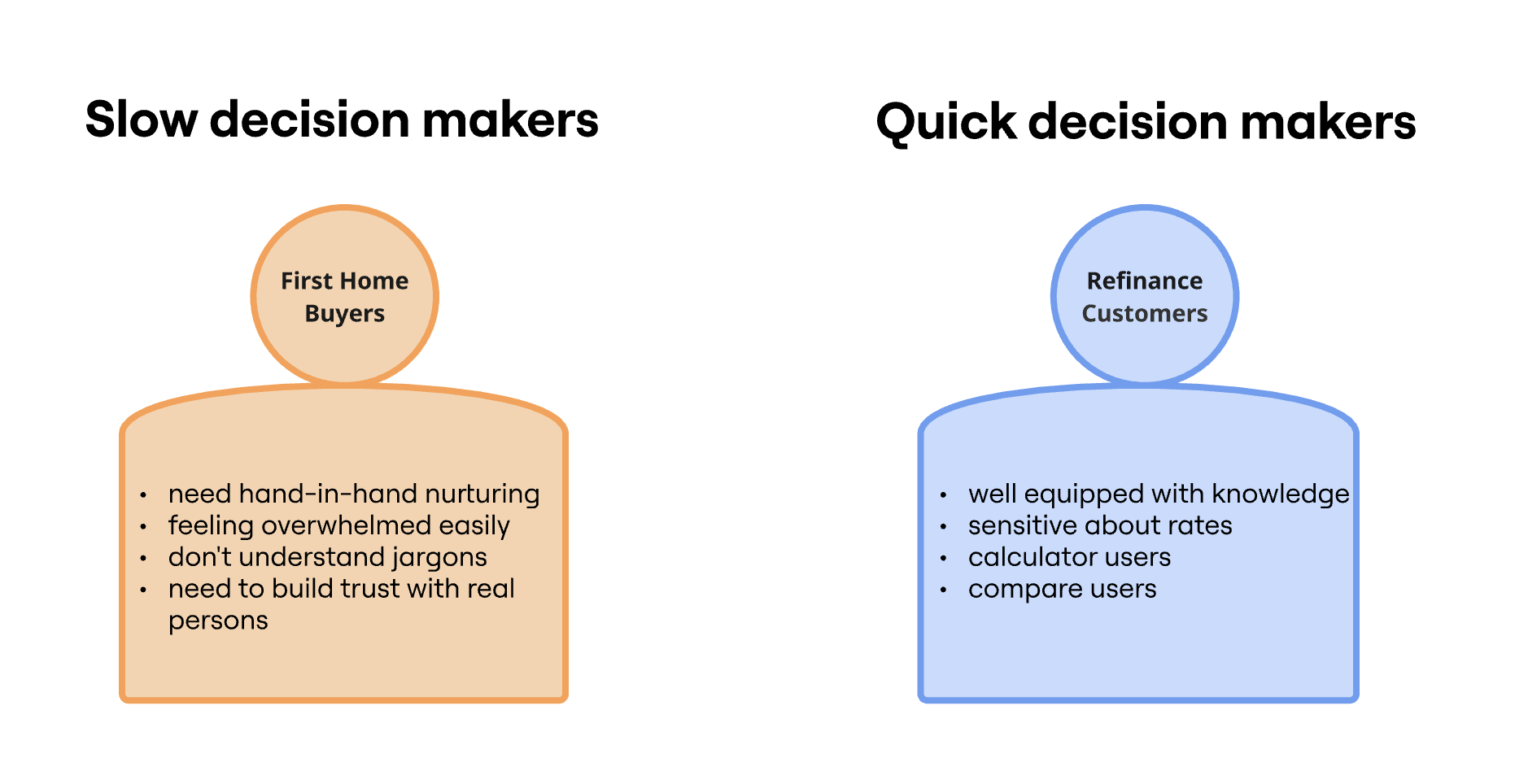
Two biggest groups of customers we needed to consider
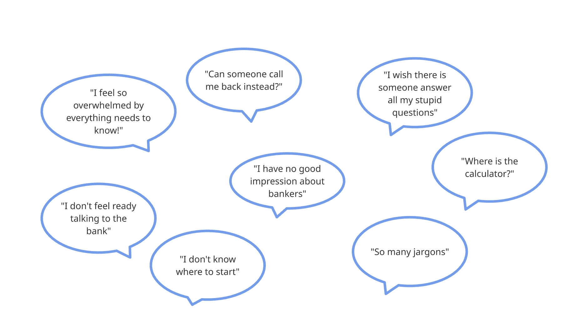
User feedback showed trust issue, overwhelming emotions and needs
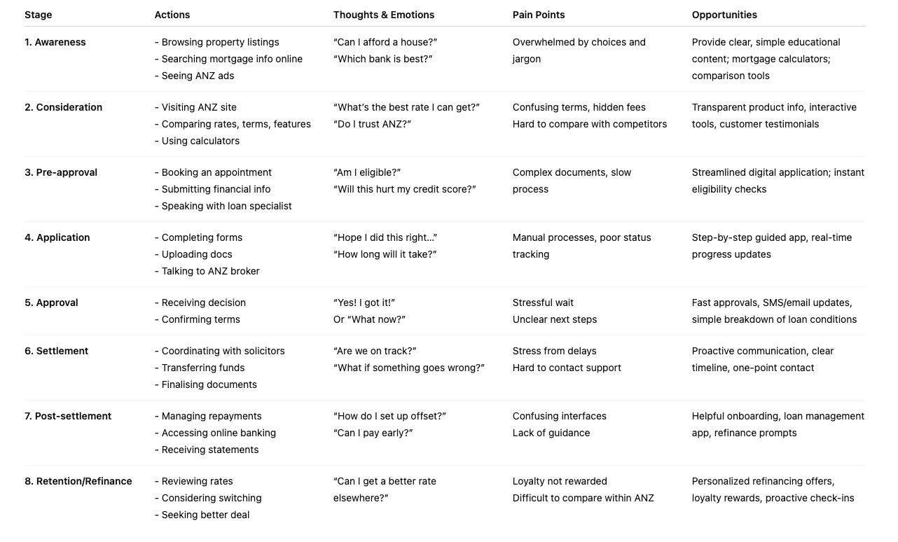
Customer Journey Map
Primary CTAs and calculators are within top 3 clicks, but they were only presented at the lower part of the page.
Define key actions for major audience
From the feedback we received, we felt ‘Contact a lender’ is a big commitment as a CTA. I suggested ‘Request callback’. Surprisingly, this suggestion resonated so well with stakeholders.
My team wasn’t able to achieve that by ourselves. It took Service Design Team and CS months to make this happen in reality. Kudos to them!
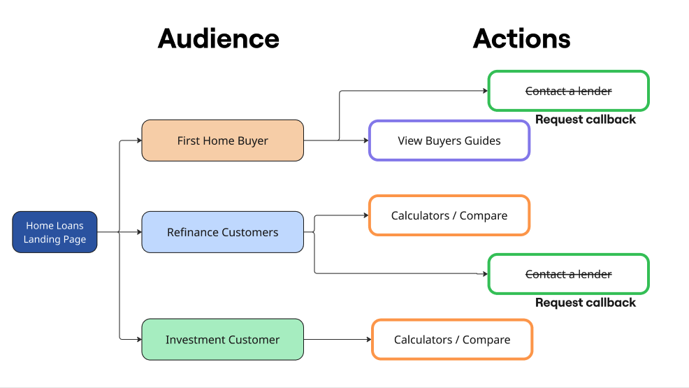
Redefined key actions for major audience
Quantitative and behavioural data
IBM Tealeaf (now known as Acoustic Experience Analytics) was of great help showing me quantitative behavioural data - Heatmap and the top clicks on the page, etc.
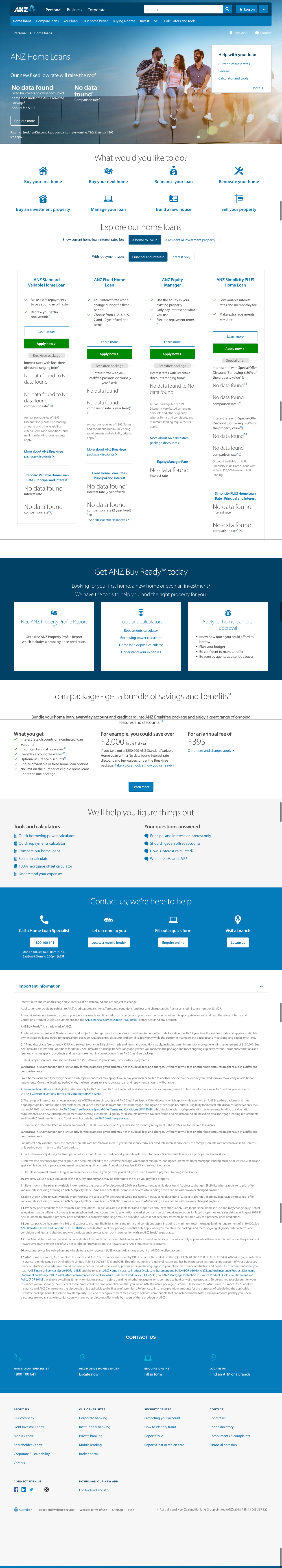
No clear value proposition was presented above the fold.
In the old design, the use of opening picture didn’t build any empathetic connection with our target audience. This landing page lacked of storytelling. Instead, it rushed customers into products and compare. No need to mention ‘texts on image’ colour contrast.

The old picture used cannot build empathetic connection with our target audience.
Design thinking
To accommodate all users, the shopfront page must be redesigned to cater to both quick and slow decision makers.
In the design, I intentionally positioned high-traffic tools above the fold, with primary and secondary CTAs available for quick decision-makers. Collaborating with a content strategist, we developed a voice and tone that appeals to first home buyers. By leaving sufficient white space, we then introduce financial products as a teaser to encourage further exploration.
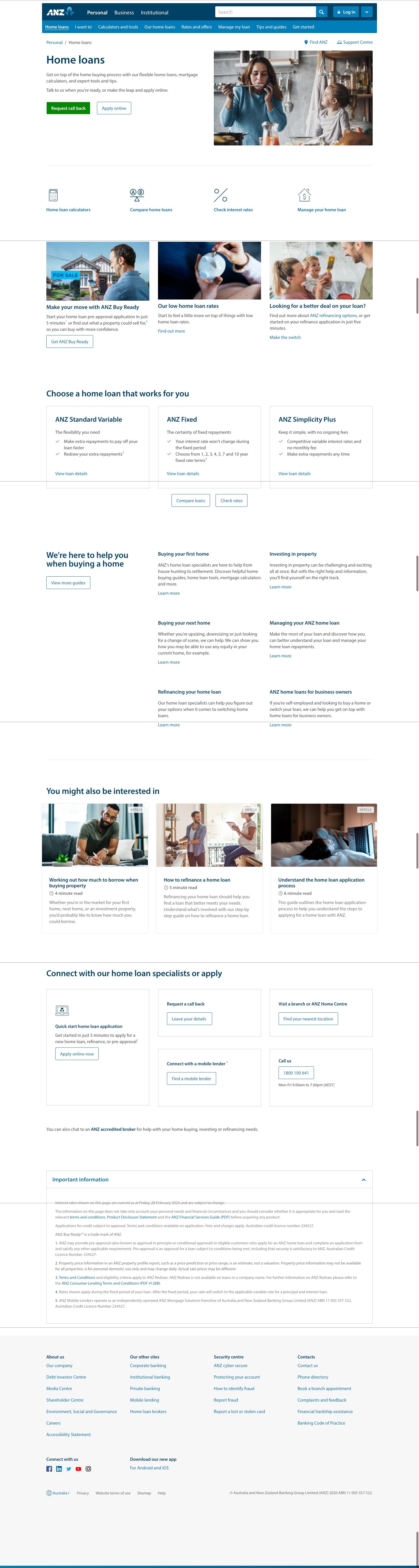
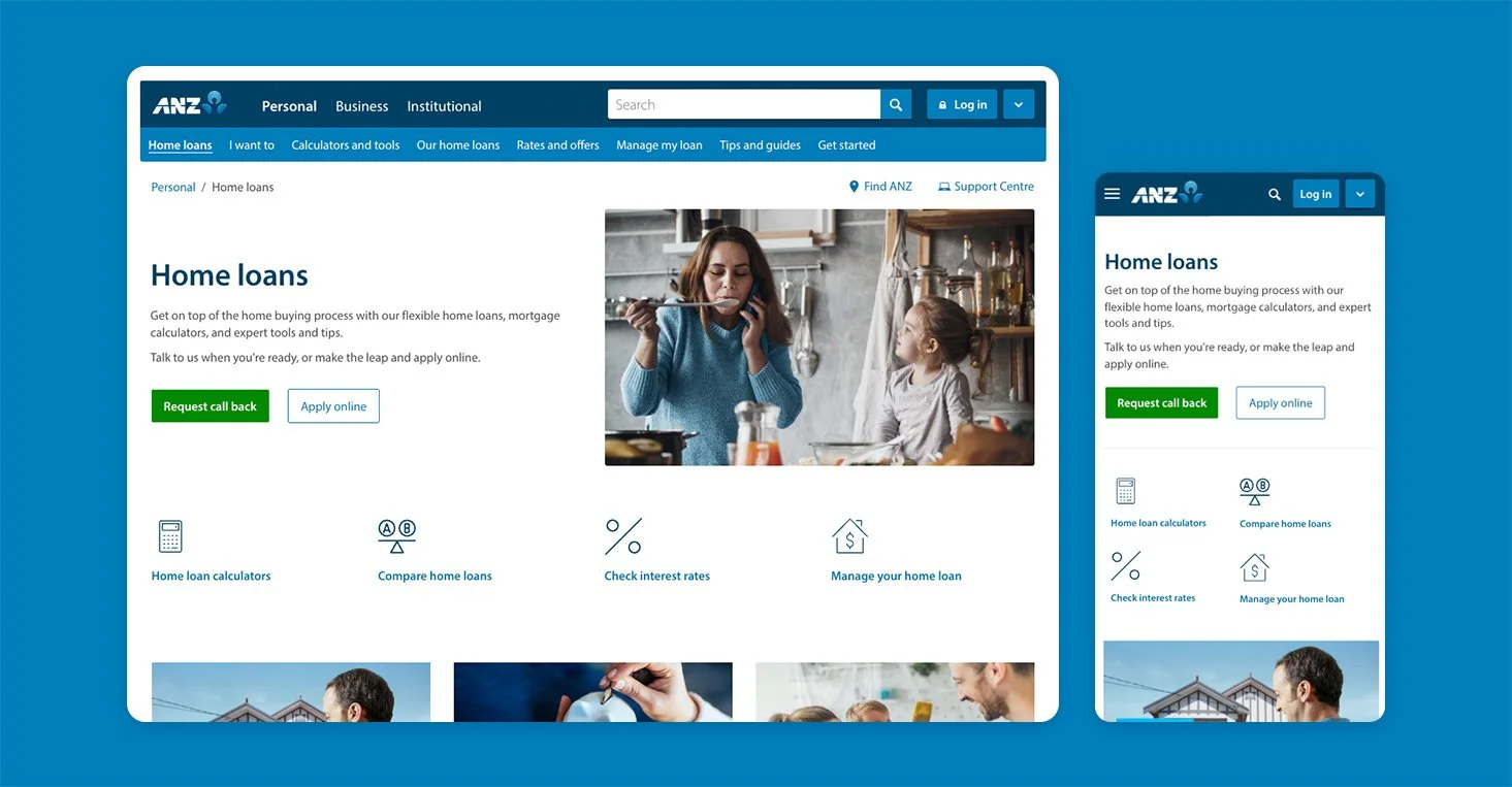
In the redesign, I redefined and surfaced primary and secondary CTAs. 4 key tasks are presented above the fold.
By leaving sufficient white space, we then introduce financial products as a teaser to encourage further exploration. Old loan products cards were overload with information, which caused overwhelming emotion for top of the funnel customers.
New loan cards are much cleaner and shorter. They instantly reduce cognition load.
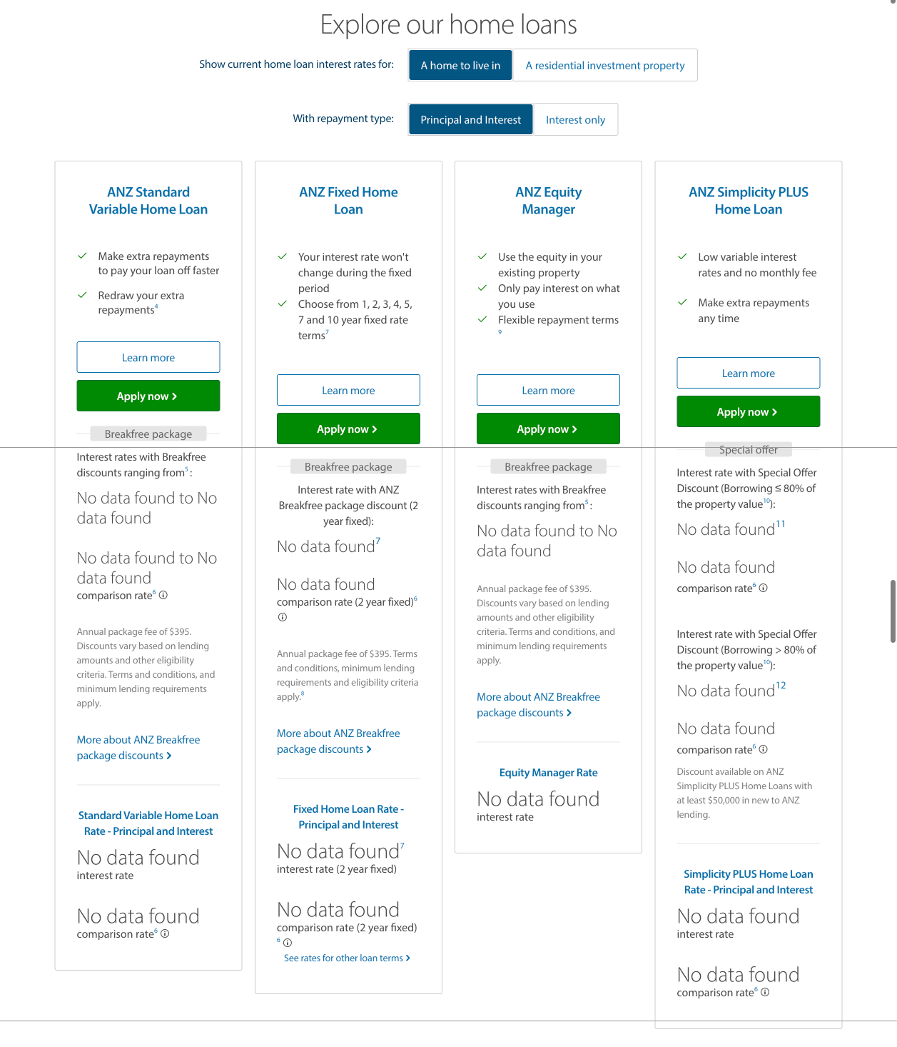
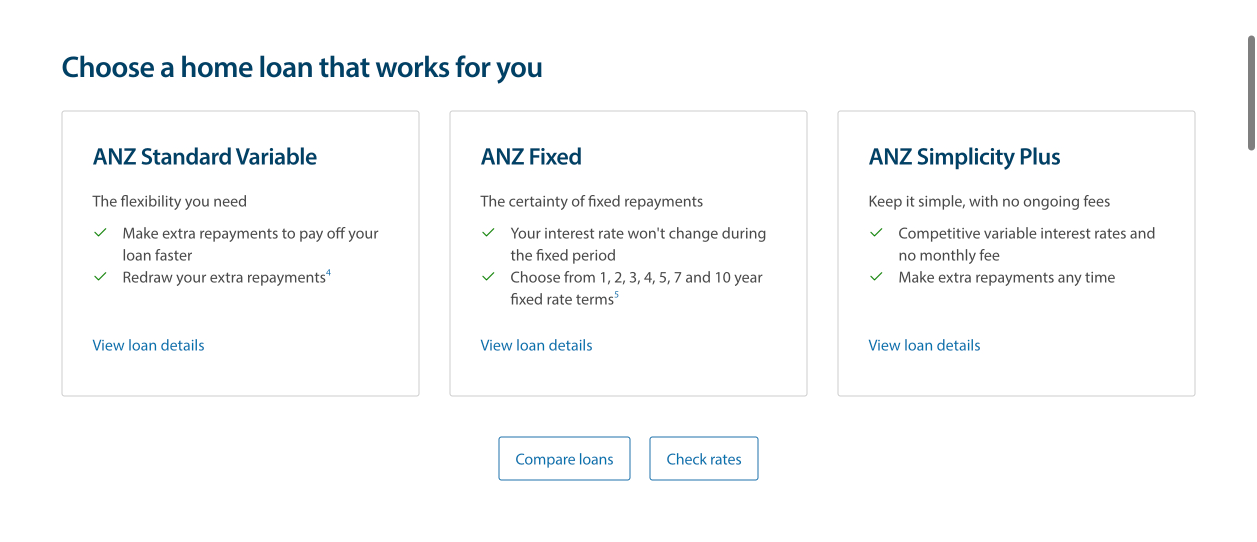
Before: Overwhelming loan products and shouting CTAs(left) After: Simplified loan product teaser reduced cognitive load instantly(right)
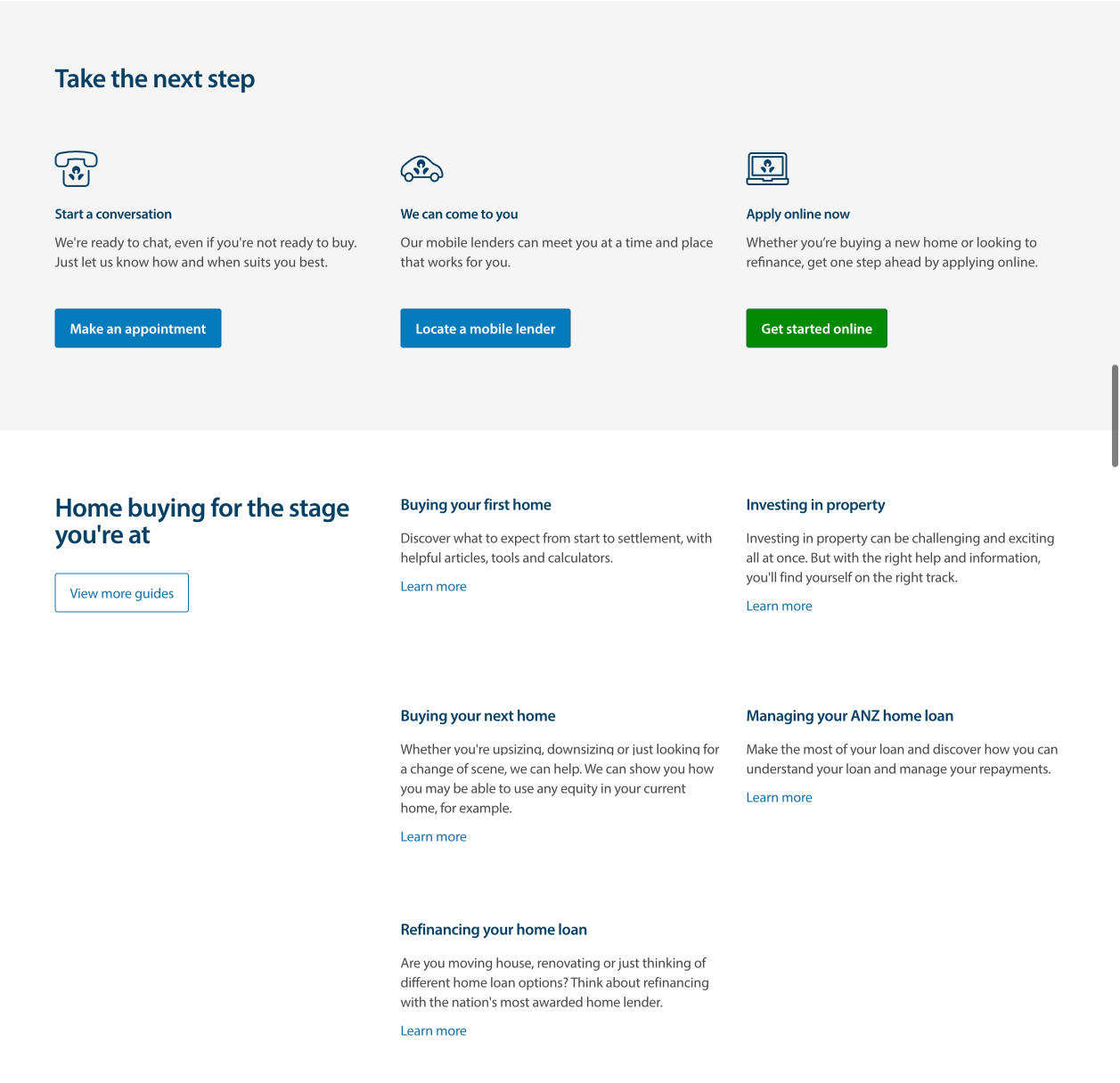
Buying guides are presented for customers in consideration funnel. This section really adds value to any prospect in supporting each and every type of life journey.
Buying guides are presented to support every type of life journey
Impact
Results after 4 weeks:
Leads started by shopfront visitors increased from 2500 to 3100/month (+24%)
Leads completed by shopfront visitors increased from 1280 to 1390/month (+7%)
Bounce rate reduced from 22.5% to 13.1%
Increase in home loan online application starts (9 per day to 13 per day) and enquiries from the shopfront (enquiry starts up from 22 per day to 47 per day, completes up from 6 per day to 12 per day).