Build your Mazda
Redesigned the ‘Build My Mazda’ acquisition experience, increasing engagement by 21% and raising ‘Save to Email’ conversion from 8% to 13%.

Team
Digital Experience / Customer Data / Marketing / Product / Dealership
Role
Senior Product Designer (Operating across strategy, experience & delivery)
Tools
Figma / Atlassian / Adobe XD / Hotjar / Inspectlet / Miro
Background
Mazda Australia as one of the top consumer vehicle brands, is looking for ways to maintain its market leading positions.
Business strategy:
Elevate the Mazda brand to a premium status to compensate for the loss of customers from other premium automotive brands.
Bring digital team in-house to enhance control over digital growth.
UX strategy:
Enhance UX and information through research phase
Create a seamless and personalised digital experience
Increase quality and quantity of leads passed to dealers
Why this project
'Build your Mazda' is the primary online user journey. We lack a vision to define what a successful build journey looks like.
Business had spent 3 years developing and iterating this build tool with our vendor partner, yet still experienced critical errors in the journey. The business had lost trust in our vendor partner and decided to bring this project in-house.
To align our goals and ensure a cohesive experience, the marketing lead, digital dev lead, and I identified the need to create a build journey vision and success metrics.
New build journey vision
The main challenge
This has been the second redesign already. Over 3 years time were spent. How might we uplift the overall metrics easily and confidently?
To address this issue, I led a series of discovery activities to explore and define problems, identifying the most critical pain points with a focus on high business impact and customer impact. These activities included:
Field trip to dealership store and interviewed the Dealer Principle in South Morang
Expert interviews with SMEs
Analysing quantitative data in Google Analytics
Review qualitative feedback in Inspeclet
Benchmarking trends and practices through competitor analysis
Facilitating ideation workshops to explore possible solutions
Main insights
I identified critical pain points across efficiency, logic, and data capture.
Streamlined User Journey
Identified that the existing 8-step build journey was overly complex compared to competitors, leading to high user drop-off.
Corrected Information Architecture
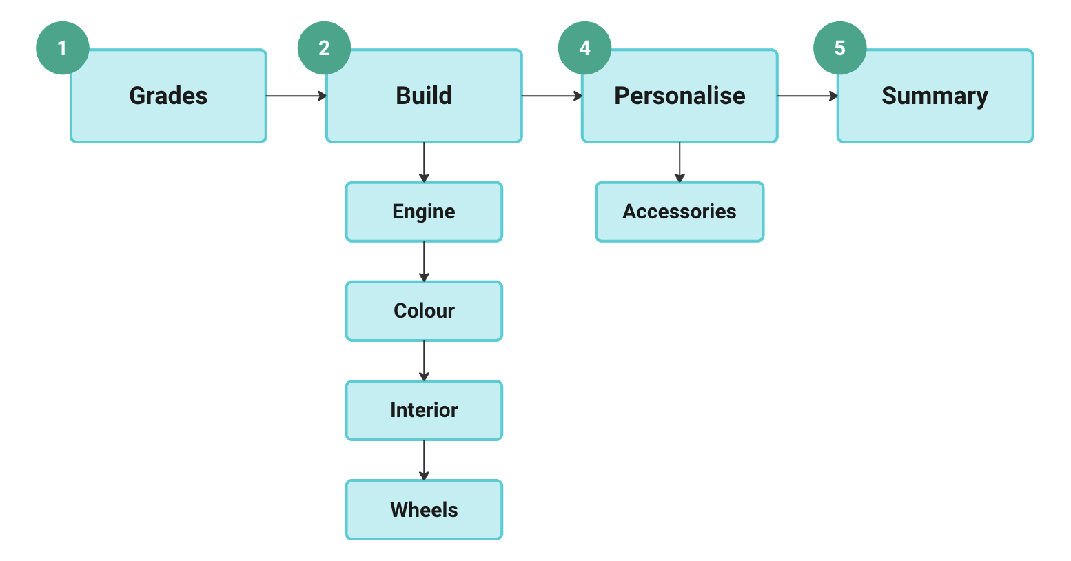
Remediated an illogical configuration sequence (Engine-Grade-Interior-Exterior) built on internal product mapping instead of human behaviour. This correction eliminated user confusion caused by conflicting selections (e.g., unavailable grades after engine choice).
Optimised UI Efficiency
Identified a restrictive layout where the core interaction area comprised only 20% of the user interface, leading to wasted screen real estate and frustrating user interactions.
Enhanced Data Strategy
Replaced the insufficient online feedback tool (Inspectlet) with Hotjar to capture high-quality, actionable user behavioral insights for continuous optimization.
Outcome & Impact
A validated prototype meets the customer needs and business strategy.
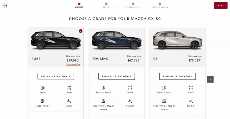
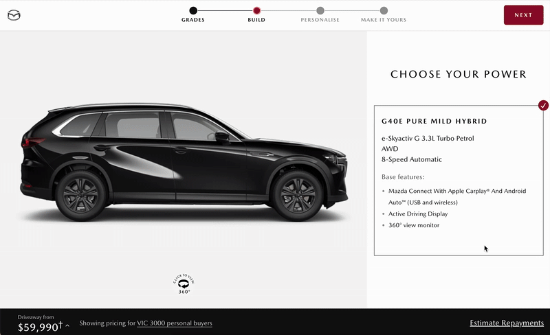
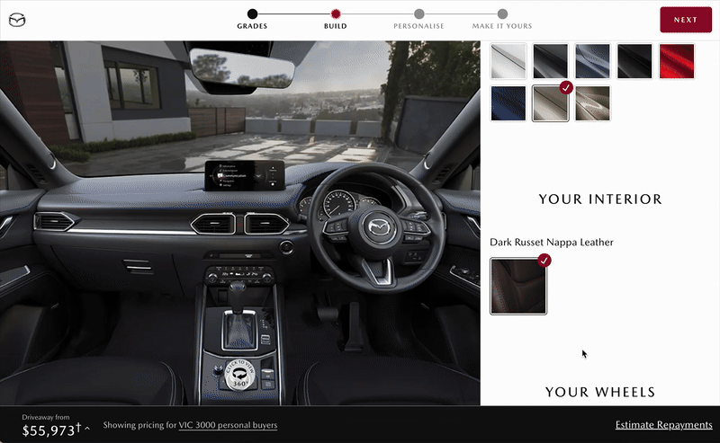
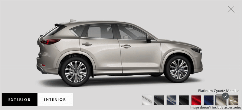
New build tool: From Grades to Summary
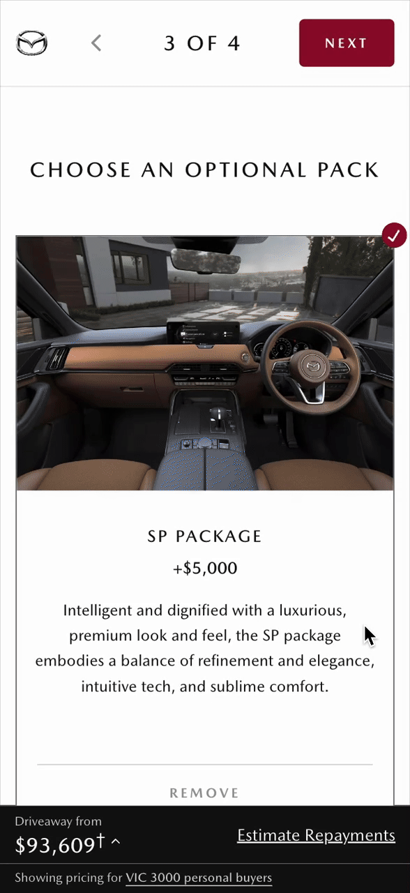
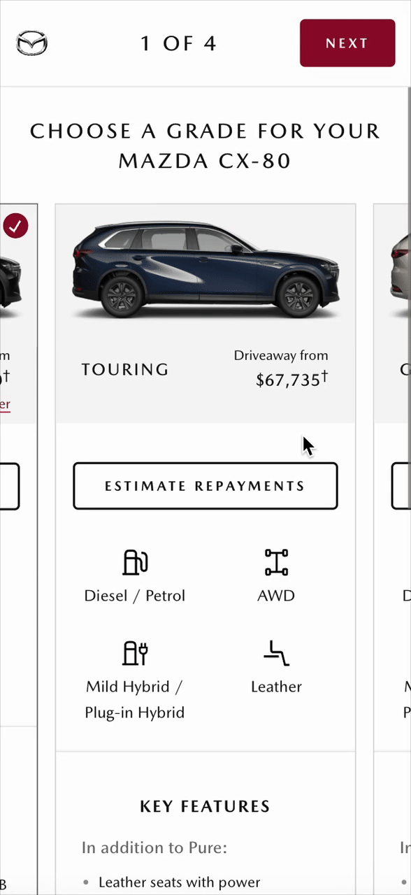
New build tool on mobile: From Grades to Build(left) From Personalise to Summary (right)
The results were felt quickly after 6 weeks:
0 critical issue was reported
Bounce rate decreased from 36% to 15%
Build finish increased from 4.8% to 61%
Email to save rate increased from 8% to 13%
Test drive booking increased from 1.9% to 4.4%
How I got there
Design process & leadership
I joined the project nearly at the finish of discovery phase of a triple-diamond design process, building on extensive exploration and discovery work completed by the previous team.
My focus was on translating that foundational research into a clearly defined scope and strategic direction. We then moved into prototyping, developing several concepts that were presented to senior leadership for validation. In parallel, we conducted rapid internal user testing to gather early feedback and refine our approach.
The project then shifted into an agile delivery rhythm, where we created a proof of concept to validate the MVP and prepare it for release.
In the final diamond, we focused on build and test - finishing detailed screen flows and UI copy, and progressively layering in additional features to evolve the product from core functionality into a more complete and mature experience.
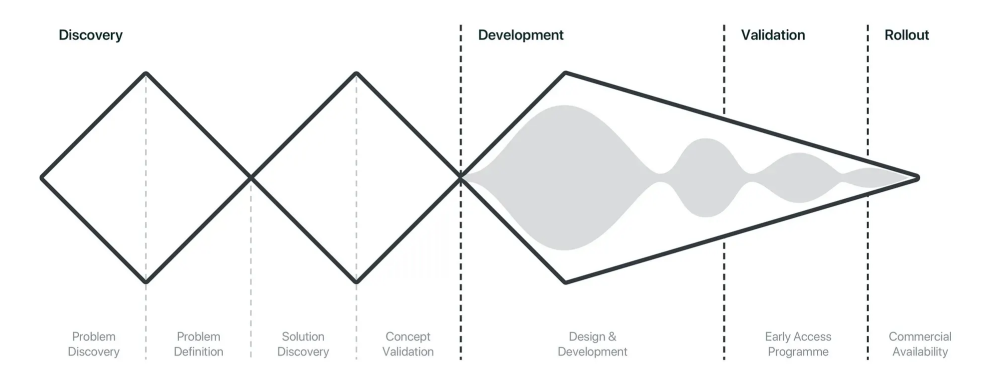
Triple Diamond design process
To define the problem accurately, team and I went on a field trip to dealership store to observe how real customers buy cars and interviewed the Dealer Principle in South Morang.
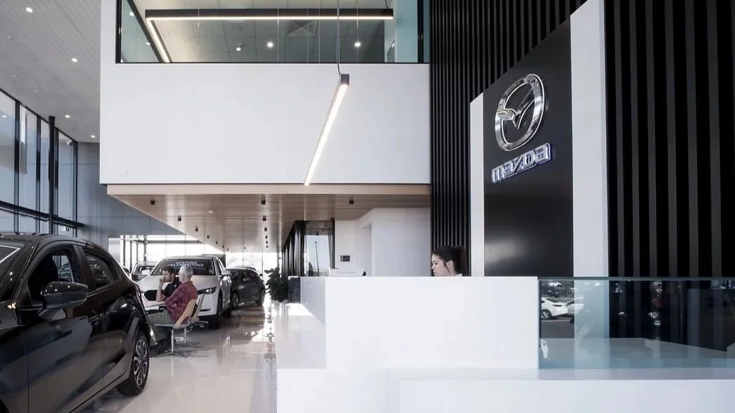
Field trip at Mazda South Morang
Design is a team sport. I facilitated solution workshops with team and key stakeholders to discover problems, brainstorm possibilities and analyse solutions.
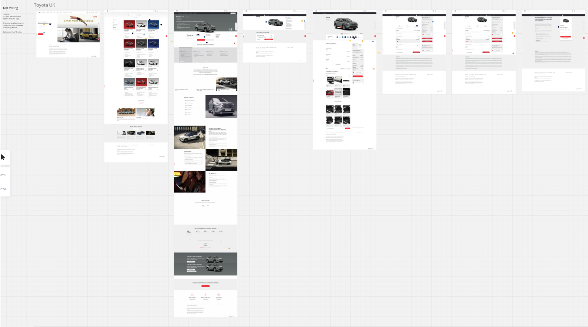
Competitor Analysis Workshop
Critical pain points
I have discovered the following issues through quantitative and qualitative research.
1.The old build journey has way too many steps (8 steps) to get through.
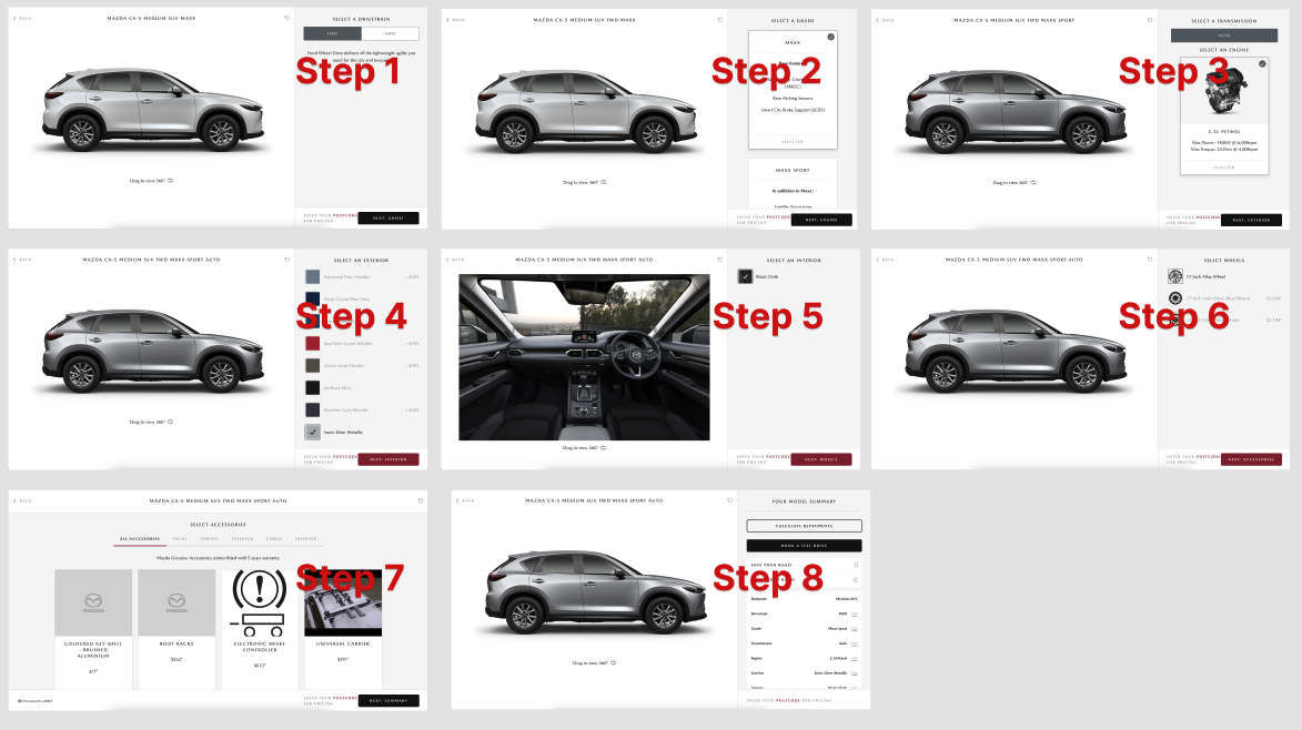
There were 8 steps to get through in old build journey.
2. Identified a critical flaw in the configuration sequence
That sequence was incorrectly based on the product mapping file structure rather than human configuration behaviour. This non-intuitive order caused user confusion and led to frustrating scenarios, such as the disappearance of preferred grade options after an engine selection.

The sequence of the steps was built based on product mapping file instead of human behaviours.
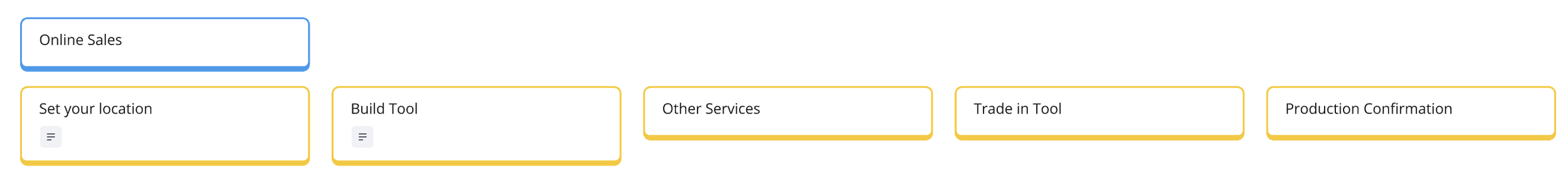
To address #1 and #2, I renewed the steps as follow.
New build tool: Steps are merged, shortened and renamed in a meaningful way in new build tool.
3. Lack of clear progress indication and poor step navigation
I addressed this by redesigning the progress bar into a stepped navigation component, which not only provided a clearer indication of progress but also enabled users to jump between steps (by injecting default selections), significantly improving navigation efficiency and control.
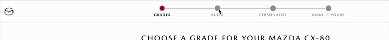
New built tool: Stepped navigation has clearer progress indication and allows skipping steps, accommodating customer ambiguity.
4. The legacy build tool suffered from a severely inefficient UI layout
The primary, high-engagement interaction area occupied only 20% of the screen. This resulted in significant underutilisation of screen real estate and restricted user interactions.
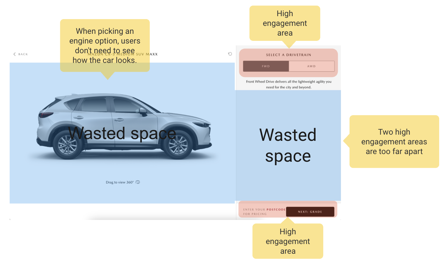
Wasted space in Step 1 Drivetrain
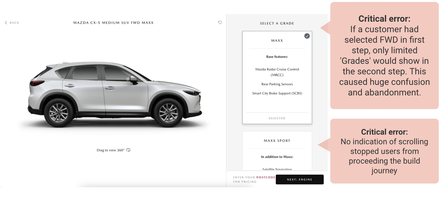
Critical errors were found in Step 2 Grades through website feedback
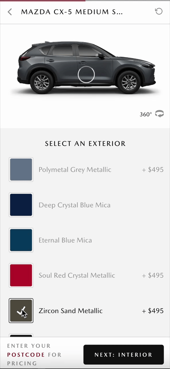
Customers had to scroll back and forth to see slow-loaded 360 colour options.
To address #4 (improve user engagement and address content clutter), I identified and deprioritised low-engagement content, implementing a solution where it is only displayed upon user interaction. Concurrently, I maximised screen utilisation by strategically leveraging the right-hand side scrollable vertical space to align with modern user scrolling habits.
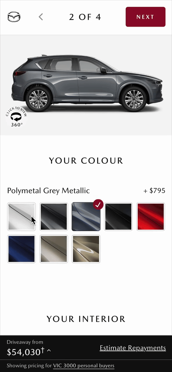
New Build Tool: Better use of RHS vertical scrollable space in build step(left) Only show each colours name when being selected.
5. Build tool is too slow to load
Build tool is media-rich. Every 360 view of a car model carries 48 images. As model types, colours, interior multiply, bandwidth quickly becomes overloaded.
To address #5, I enabled the 360 view only when clicking 'Click to view 360', so that the maximum preloaded bandwidth is reduced by 48 times!
For mobile users, it provides an immersive experience to be able to interact with full screen. (Previously, the 360 view area was only the size of a stamp.)
New Build Tool: Smooth spin of 360 interior view on desktop(left) Full screen 360 exterior view on mobile(right)
Overcame UX Maturity Barriers
Acknowledged the organisational constraint of varying UX maturity (limited access to external customers) and proactively developed an effective internal recruitment strategy to ensure continuous testing.
Special thanks to our dealership support, experience team and to our super star digital dev team, working tirelessly to make it happen.