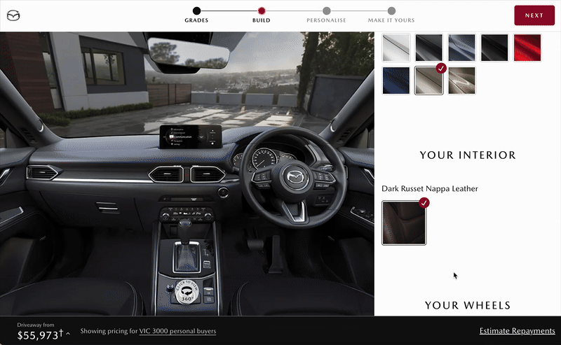
Build My Mazda
Let the redesign and delivery of the ‘Build My Mazda’ car configuration experience, raising completion rates from 4% to over 60%. Lifted ‘Save to Email’ rate and ‘Test Drive’ bookings significantly.
Client
Mazda Australia
Role
Senior UX UI Designer
Team
Product / Dev / Marketing / Dealership
Duration
Jun 2022 - Sep 2022
-
Evaluated current UX tools and introduced multiple ways of UX research methods and new tools within the budget to establish baseline insights and deepen understanding of customer behaviour
Enabled regular dealership visits for the team to gather real-world customer insights
End-to-end UX and UI practice
Contributed to prioritisation for MVP
Project goals
Why this project mattered
Build My Mazda is the primary online customer journey on the website of Mazda Australia, allowing users to configure and visualise their future vehicle while supporting key conversion actions such as ‘save configuration to email’ and ‘book test drive’.
After 3 years of 2 versions of development with an external vendor, the journey still had several critical usability and performance issues. Mazda Australia decided to bring the platform in-house, creating an opportunity to build UX capability in-house and redesign the journey based on stronger customer insights.
The challenges
What I was facing
-
Limited visibility into user behaviour. The previous qualitative analytics tools were pretty outdated.
-
The engineering team has multiple changes in development leads. Most of the time, there is only one full stack developer supporting this project.
DISCOVERY
Super fast research phase
To define the problem accurately, I initiated regular dealership visits to gather real-world customer insights. There, I observed and interviewed the sales staff to understand customer behaviours.
I also facilitated solution workshops with team and key stakeholders to discover problems, brainstorm possibilities and analyse solutions.
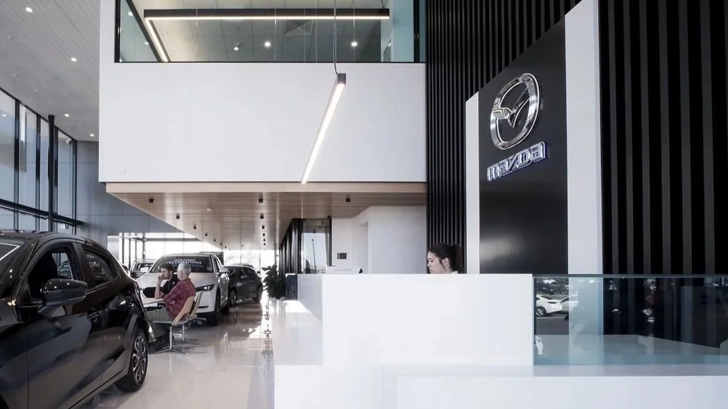
Dealership visit in Mazda South Morang
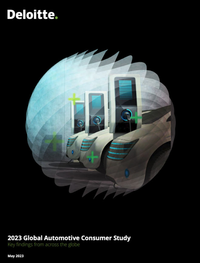
Study Deloitte's Global Automotive Consumer Study
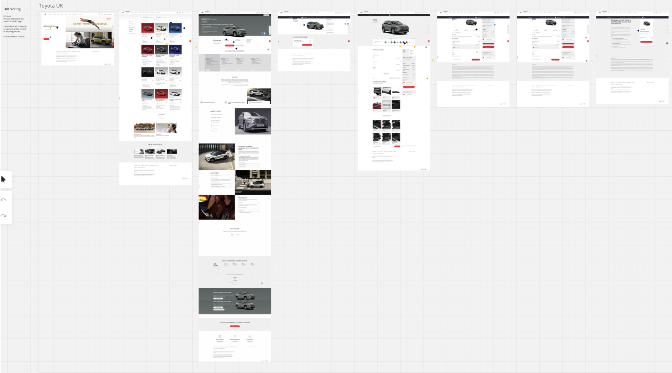
Let competitor analysis workshop
5 key user cohorts and personas were identified
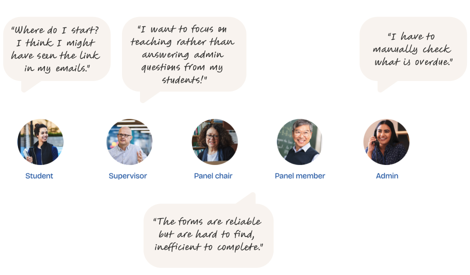
Students’ problem
Students couldn’t find task link because it lived in email threads.
Supervisors’ problem
Supervisors lacked visibility over where milestones sat in the process and had to chase progress manually.
Admins’ problem
Admin lacked oversight of what was overdue.
Shared problem by all cohorts
The milestone forms were reliable but hard to find and inefficient to complete.
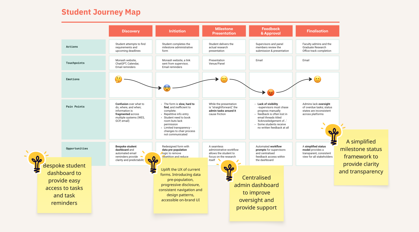
Journey mapping to reveal opportunities
Research insights revealed several key opportunities to improve the milestone experience including bespoke student dashboard, structured, accessibility-compliant task forms for student, supervisor and panel, establish a on-brand form design guideline, centralised admin dashboard and a simplified milestone status framework to provide clarity and transparency.
WORKING WITH PEOPLE
Alignment and alignment
"It was challenging to see the project pulled in different directions by members of the same team."
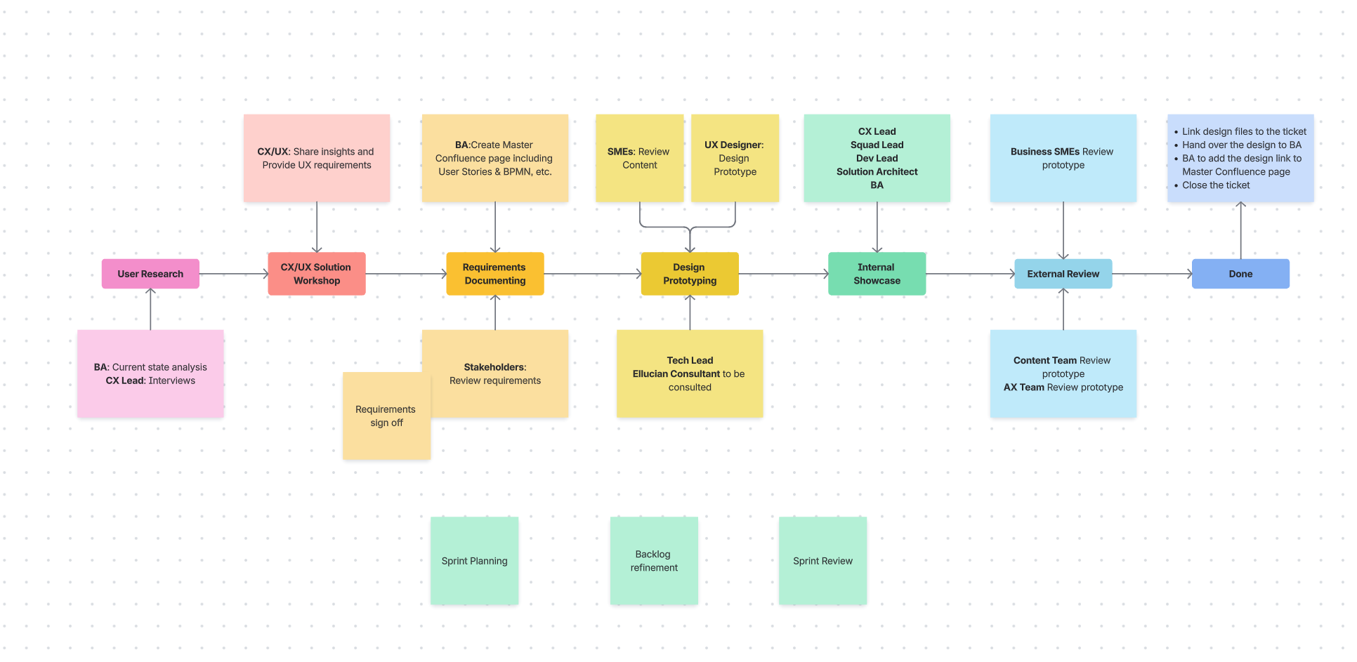
Before initiating solution design, I noticed a lack of alignment and shared momentum within the newly formed team. There were differing expectations of “when should CX/UX be involved?”, and multiple stakeholder perspectives influenced the project direction.
With the support of the project manager, I facilitated alignment around a structured product design process. The goal was to provide clarity in “What does each role need to start?““How does it align with agile practice?””What is each role's Definition of Done?”.
The team members aligned and contributed on this approach, and it became the foundation for our collaboration and delivery moving forward.
IDEATION & UI DESIGN
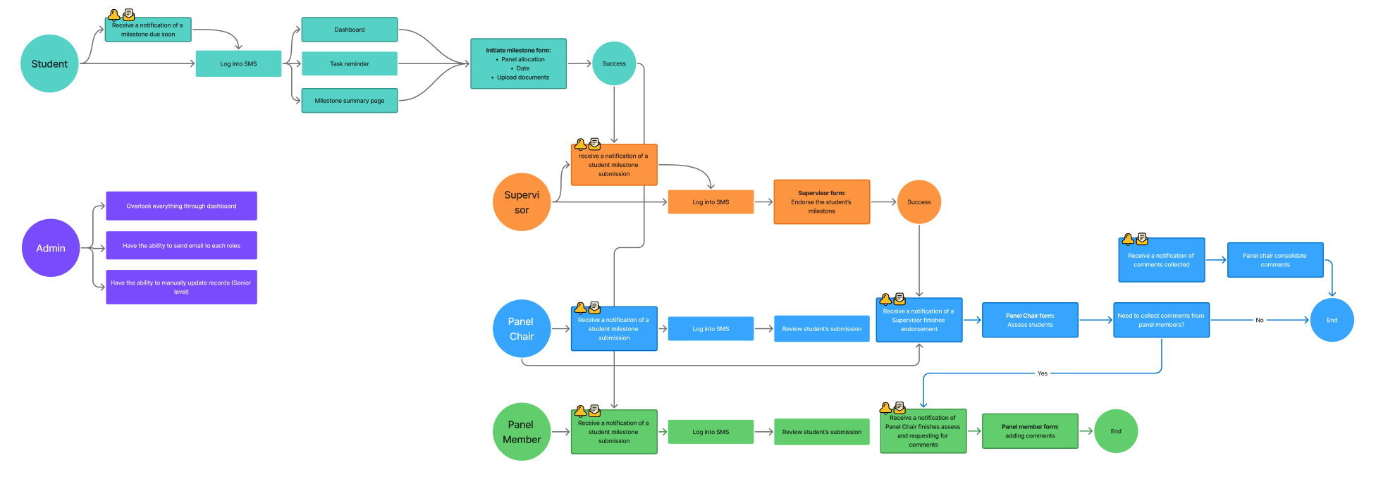
Mapping out task flow based on BA’s work
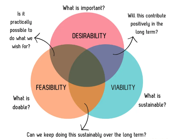
Desirability vs. Feasibility vs. Viability
Although the future experience lives within the new platform, most of the functionalities we designed were custom, because the out-of-the-box capability could not support the end-to-end workflow required.
I worked with the team to scope out what needed to be designed and built in MVP.
MVP trade-offs to prioritise low hanging fruits
After assessing platform constraints and delivery effort, I contributed in prioritising high-impact, low-effort tasks to define the MVP and deliver immediate value. Higher-effort initiatives, such as the admin dashboard, were scoped for future releases. I supported this by creating concept designs to define the vision and ensure readiness when the platform could support it.
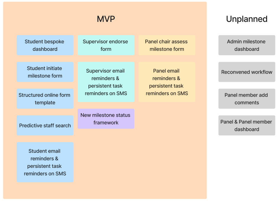
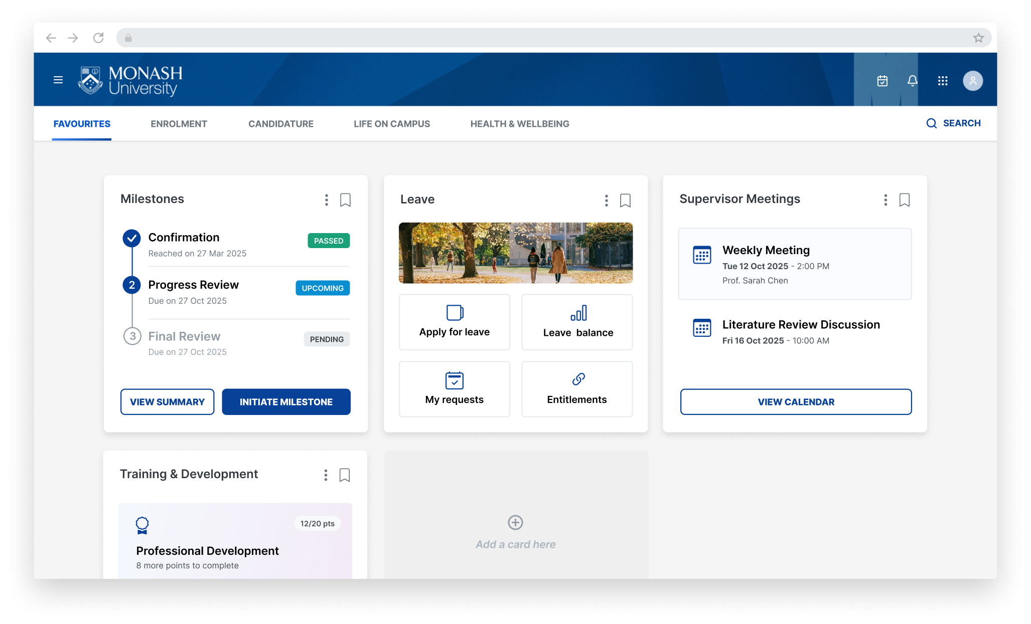
I designed bespoke student dashboard that helps students view and access passed, upcoming and future milestones. It also integrated with other ongoing projects like manage my leave, calendar and training and development.
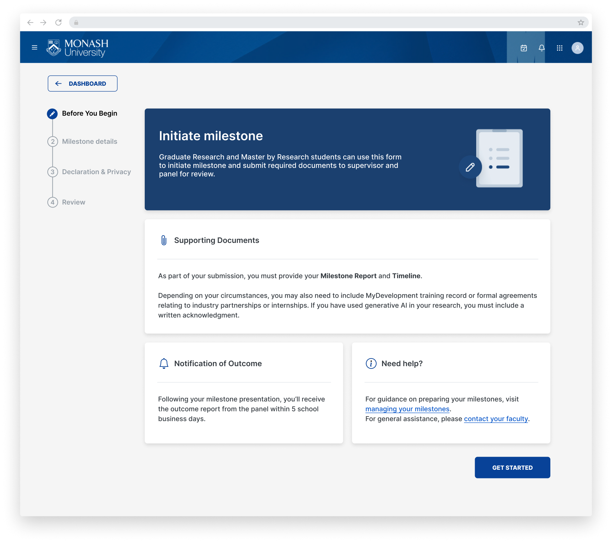
I designed the on-brand look and feel of 'Before your begin' page, using it as template for all other online applications to boost experience consistency.
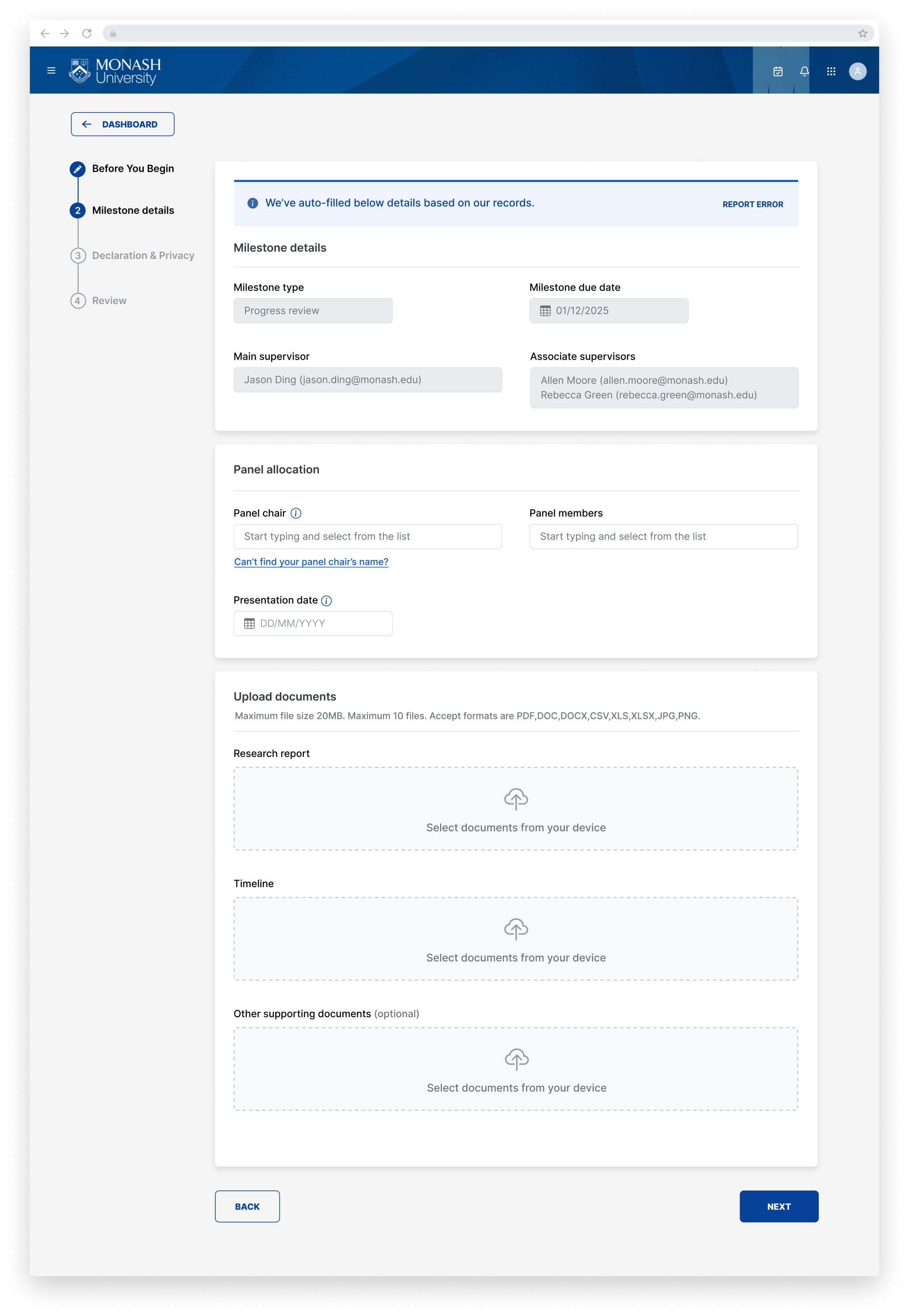
I uplifted the form design patterns and interactions with the guidelines like 'Progressive disclosure', 'Pre-populate known data to reduce user input repetition', 'Error-preventing fall back solution', etc.
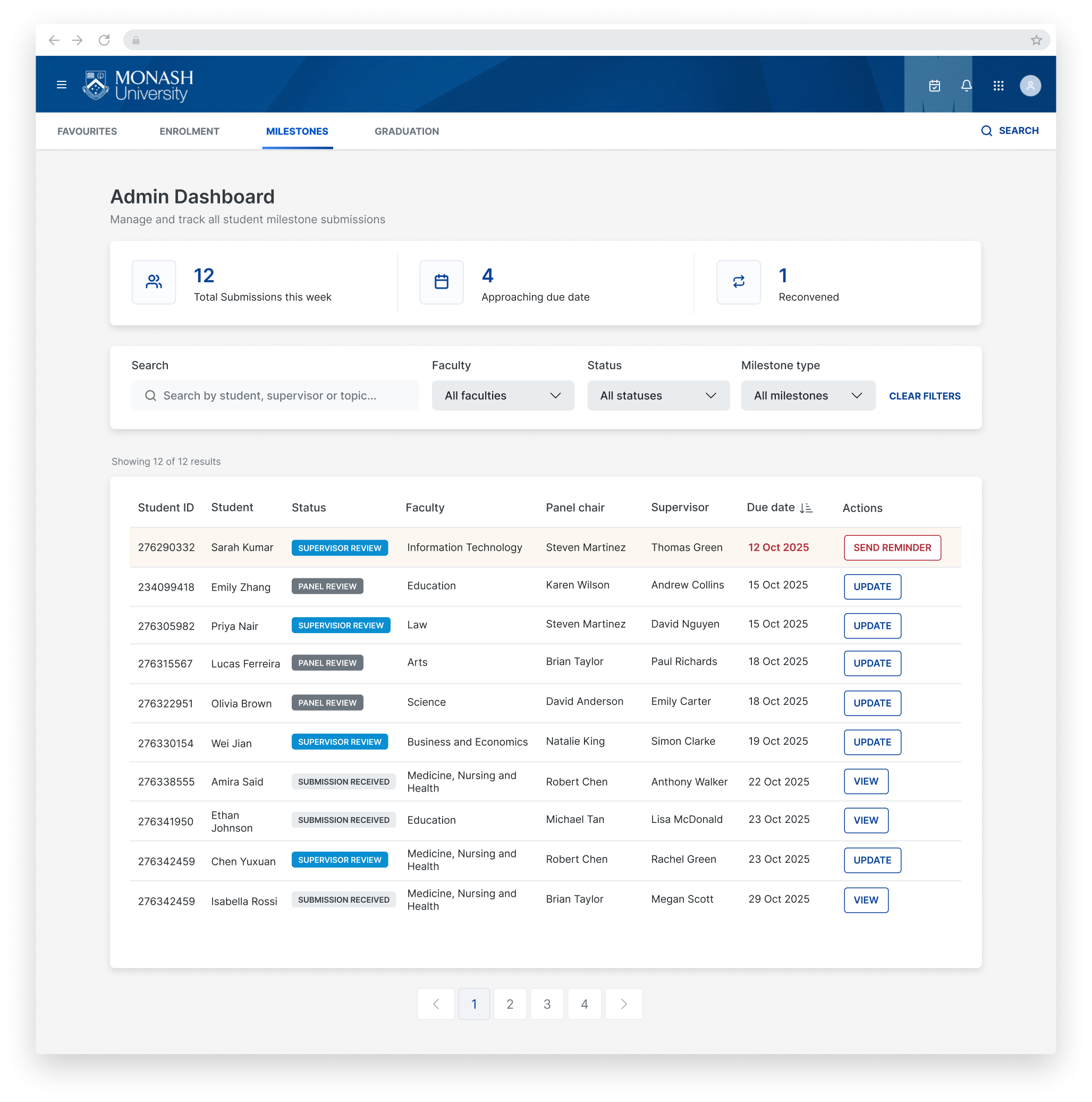
Building on this foundation, I designed a admin concept dashboard that centralised milestone tracking and management, improving visibility, efficiency, and administrative oversight.
Alongside the experience design work, I established a Figma component library and introduced structure around how the team uses components, patterns, and documentation. This created greater consistency, improved delivery speed, and enabled scalable design across a team of five designers.
DesignOps practice that is used by 5 designers
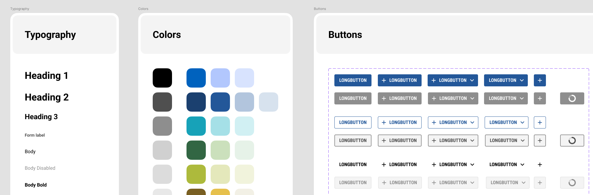
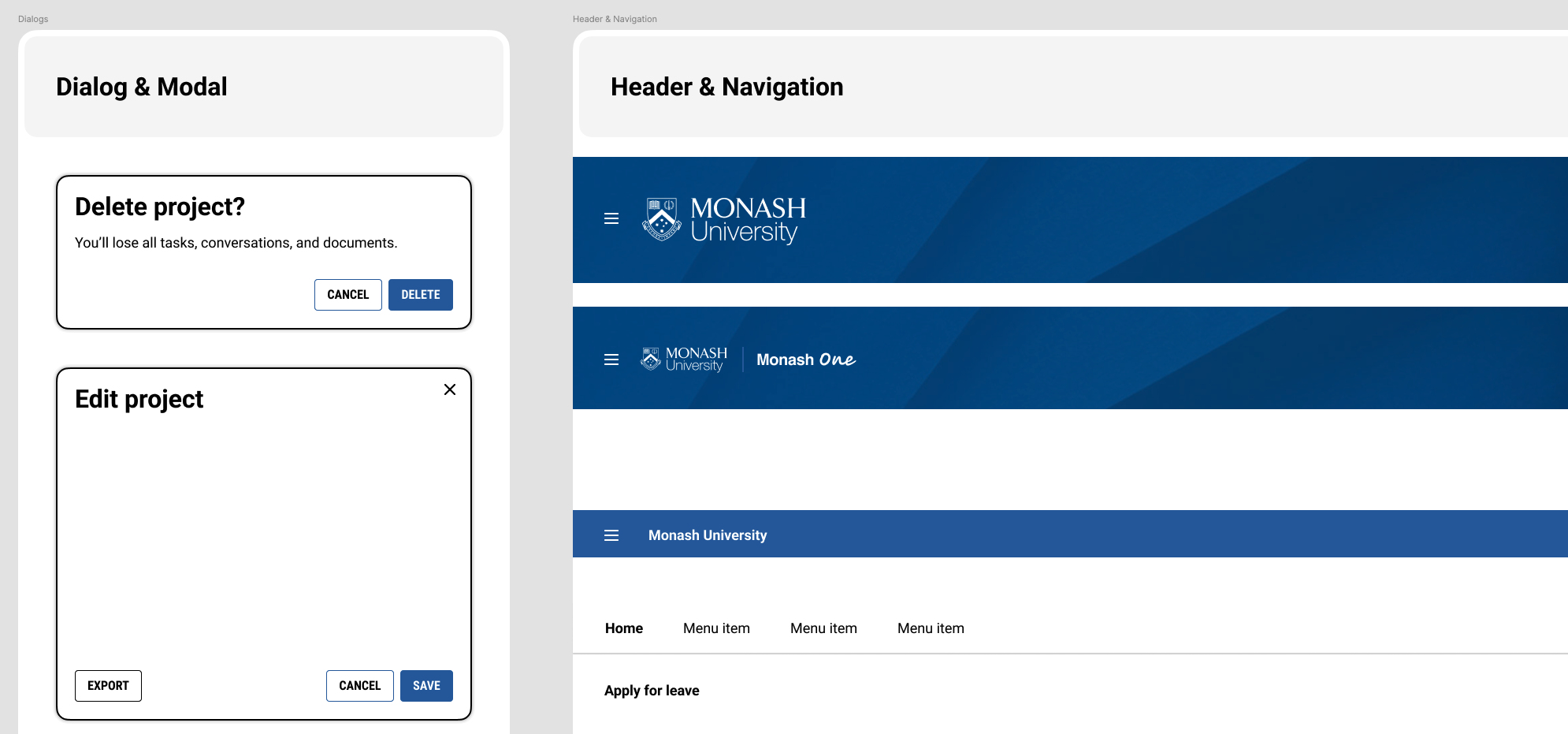
Created Figma design system that has been utilised by a team of 5 designers
Outcome & Impact
82%
Students satisfaction improved
0
Critical error in user validation testing
38%
Reduction in form time to complete
1
Iteration planned to simplify student initiation
“Now everything is much clearer. I can see my progress, and the reminders help me stay on track.”
Reflections
Reflecting on this project, the most challenging part was not the workflow redesign itself, but untangling the ecosystem of expectations, behaviours, and ownership that had evolved over time. The ambiguity within the program created uncertainty, but it also became an opportunity for design to lead.
This environment pushed me to step forward, align the team around a shared direction, and make thoughtful and sometimes difficult decisions without having complete clarity.